This data is from the CDC website at https://data.cdc.gov/Foodborne-Waterborne-and-Related-Diseases/Botulism/66i6-hisz and has counts of confirmed botulism cases in the United States by state, year, type of botulism toxin, and transmission type. I will be cleaning an working with all 5 variables.
#read in the data and assign to botulismdatabotulismdata<-read_csv("dataanalysis-exercise/rawdata/Botulism.csv")
Rows: 2280 Columns: 5
── Column specification ────────────────────────────────────────────────────────
Delimiter: ","
chr (3): State, BotType, ToxinType
dbl (2): Year, Count

ℹ Use `spec()` to retrieve the full column specification for this data.
ℹ Specify the column types or set `show_col_types = FALSE` to quiet this message.
#checking structure and summary of data setstr(botulismdata)
    State                Year        BotType           ToxinType
 Length:2280        Min.   :1899   Length:2280        Length:2280
 Class :character   1st Qu.:1976   Class :character   Class :character
 Mode  :character   Median :1993   Mode  :character   Mode  :character
                    Mean   :1986
                    3rd Qu.:2006
                    Max.   :2017
     Count
 Min.   : 1.000
 1st Qu.: 1.000
 Median : 1.000
 Mean   : 3.199
 3rd Qu.: 3.000
 Max.   :59.000
Change to Factors
BotType and ToxinType are both classified as characters but would be better represented as factors so I will change them.
#change BotType and ToxinType to factor variablesbotulismdata$BotType <-as.factor(botulismdata$BotType)botulismdata$ToxinType <-as.factor(botulismdata$ToxinType)#confirm they were both changedstr(botulismdata)
#Check is there is any missing datacolSums(is.na(botulismdata))
            State              Year Transmission Type        Toxin Type
               34                 0                 0                 0
            Count
                0
Remove NAs
All the NA entries appear to be in the state column. There are 2280 observations so I decided to just remove the 34 NA values since they don’t make up a large percentage of the data overall.
#Drop the NA values in the state columnbotulismdata <-drop_na(botulismdata, State)#Confirm number of observations dropped from 2280 to 2246str(botulismdata)
##install and load psych package to use describe to see a summary of data, also run summarylibrary(psych)
Attaching package: 'psych'
The following objects are masked from 'package:ggplot2':

    %+%, alpha
summary(botulismdata)
    State                Year      Transmission Type   Toxin Type
 Length:2246        Min.   :1899   Foodborne: 899    A      :958
 Class :character   1st Qu.:1976   Infant   :1124    B      :778
 Mode  :character   Median :1992   Other    :  72    Unknown:369
                    Mean   :1985   Wound    : 151    E      : 72
                    3rd Qu.:2006                     F      : 41
                    Max.   :2017                     Bf     :  8
                                                     (Other): 20
     Count
 Min.   : 1.000
 1st Qu.: 1.000
 Median : 1.000
 Mean   : 3.223
 3rd Qu.: 3.000
 Max.   :59.000
describe(botulismdata)
                   vars    n    mean    sd median trimmed   mad  min  max range
State*                1 2246   23.72 15.98     24   23.36 25.20    1   50    49
Year                  2 2246 1985.50 26.60   1992 1989.05 22.24 1899 2017   118
Transmission Type*    3 2246    1.77  0.80      2    1.62  0.00    1    4     3
Toxin Type*           4 2246    5.83  4.83      7    5.42  8.90    1   14    13
Count                 5 2246    3.22  4.66      1    2.05  0.00    1   59    58
                    skew kurtosis   se
State*              0.06    -1.51 0.34
Year               -1.05     0.23 0.56
Transmission Type*  1.22     1.51 0.02
Toxin Type*         0.47    -1.09 0.10
Count               3.90    21.46 0.10
AKbotulism<-readRDS("cleanbotulismdata.RData") #load() the dataset was shooting errors so I renamed it to read it inhead(AKbotulism)
# A tibble: 6 × 5
  State   Year `Transmission Type` `Toxin Type` Count
  <chr>  <dbl> <fct>               <fct>        <dbl>
1 Alaska  1947 Foodborne           Unknown          3
2 Alaska  1948 Foodborne           Unknown          4
3 Alaska  1950 Foodborne           E                5
4 Alaska  1952 Foodborne           E                1
5 Alaska  1956 Foodborne           E                5
6 Alaska  1959 Foodborne           E               10
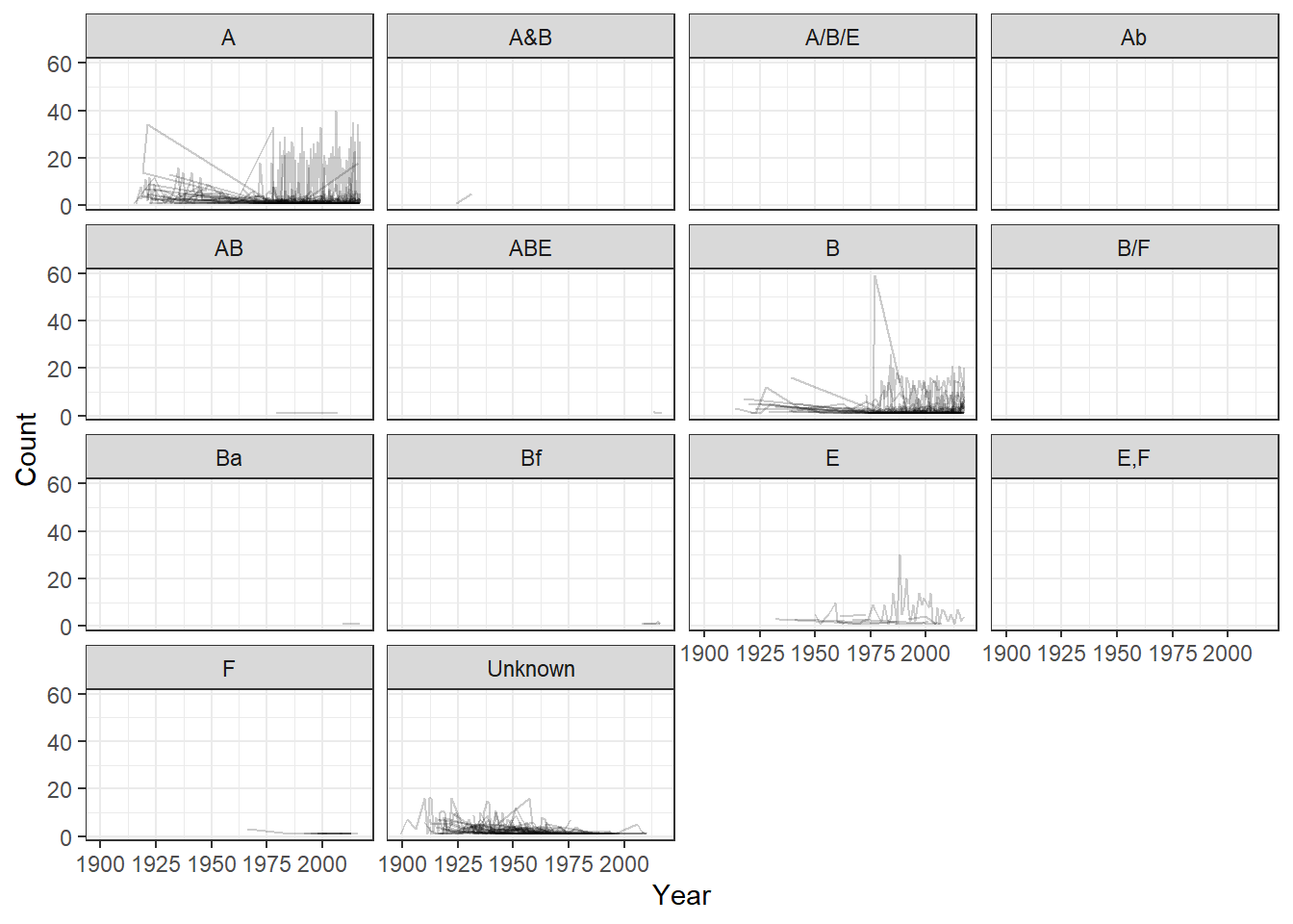
I’m interested to see how the toxin types and counts varied by year.
Grouped By State
library(ggplot2)ggplot()+geom_line(aes(x=Year, y=Count, group = State), data=AKbotulism, alpha =0.2)+facet_wrap(.~`Toxin Type`) +theme_bw()
`geom_line()`: Each group consists of only one observation.
ℹ Do you need to adjust the group aesthetic?
`geom_line()`: Each group consists of only one observation.
ℹ Do you need to adjust the group aesthetic?
`geom_line()`: Each group consists of only one observation.
ℹ Do you need to adjust the group aesthetic?
`geom_line()`: Each group consists of only one observation.
ℹ Do you need to adjust the group aesthetic?
Well that was confusing, let’s try it grouped by Transmission Type.
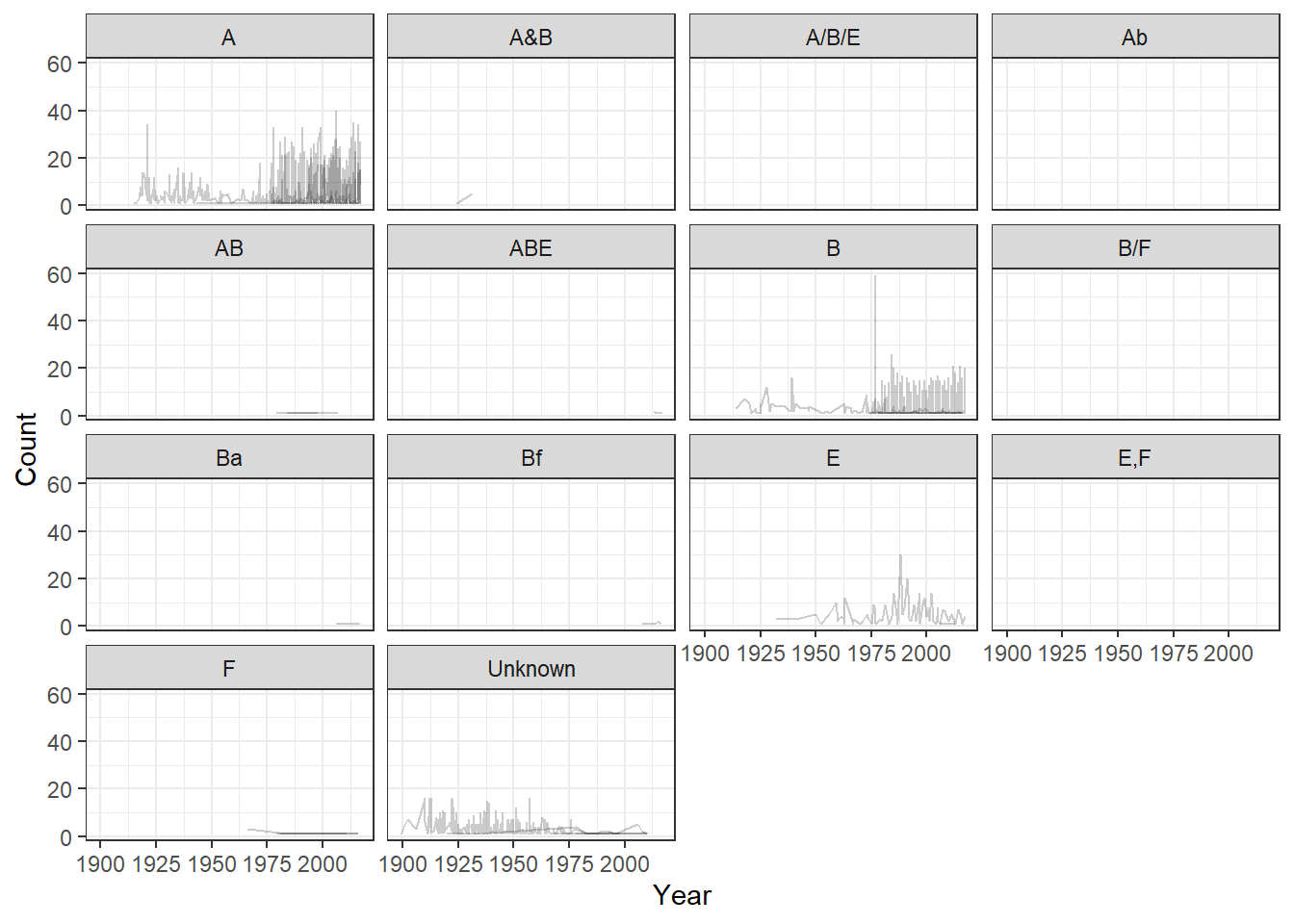
Grouped by Transmission Type
ggplot()+geom_line(aes(x=Year, y=Count, group =`Transmission Type`), data=AKbotulism, alpha =0.2)+facet_wrap(.~`Toxin Type`) +theme_bw()
`geom_line()`: Each group consists of only one observation.
ℹ Do you need to adjust the group aesthetic?
`geom_line()`: Each group consists of only one observation.
ℹ Do you need to adjust the group aesthetic?
`geom_line()`: Each group consists of only one observation.
ℹ Do you need to adjust the group aesthetic?
We can see some better patterns here if we squint really hard, but faceting by toxin type allows for too many options to get a good idea of what is happening within the data. Toxins A, B, E, and Unknown seem to be the most prevelant types, so I want to focus in on them
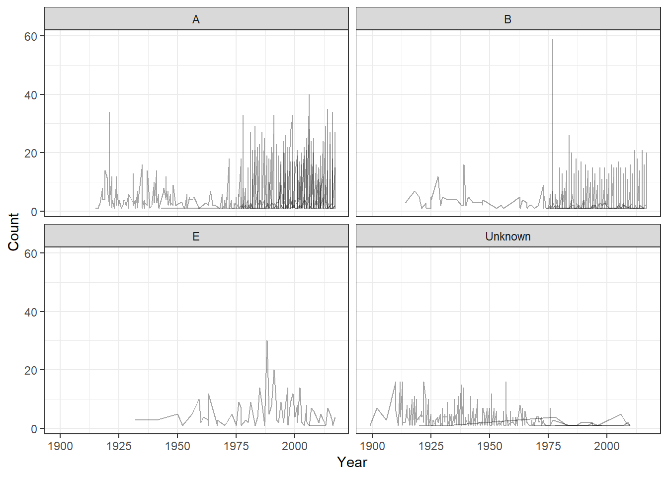
ggplot()+geom_line(aes(x=Year, y=Count, group =`Transmission Type`), data=ABE, alpha =0.35)+facet_wrap(.~`Toxin Type`) +theme_bw()
Awesome, now we can start to see the patterns and the ranges better among the data. It seems that Type A is popular and only continues to grow in prevalence. B seems to as well though on a smaller scale. I’m not really sure what’s going on with E, and the number of unknown seems to be decreasing. This may be because these cases are becoming better identified and may account for some of the increase in A and B types (all right around 1975).
While I grouped by Transmission Type to better see the data, that grouping isn’t telling us much at the moments, so let’s see if there’s any patterns within it.
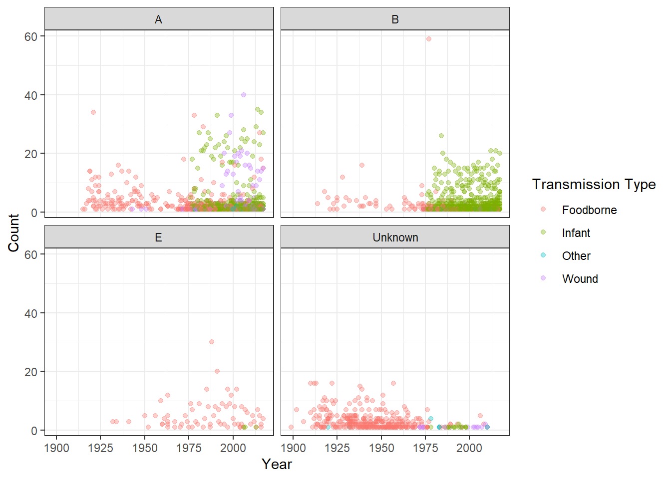
ggplot()+geom_point(aes(x=Year, y=Count, color =`Transmission Type`), data=ABE, alpha =0.35)+facet_wrap(.~`Toxin Type`) +theme_bw()
This is pretty cool! Most of the new cases for A and B are transmitted by infants with foodborne transmission nearly dying out overnight. The number of unknown types of foodborne transmission also snuffed out around the same time - I wonder if there was new food safety legislation in place that would explain the mass decrease. However, Type E remains mainly foodborne and pretty constant across time. Also with the drastic increase in infant transmission around when foodborne transmission ended I wonder if the classifications for transmission were changed. There’s no instance of “infant” transmission until 1975.
I don’t know enough about botulism to provide more commentary, but this posed some interesting questions I’ll keep in mind if this topic arises again.